Most Popular Kitchen Cabinet Colors of 2026
Are you feeling overwhelmed trying to choose the perfect color for your kitchen cabinets? You’re not alone—many people struggle with narrowing down options that match their style and create the vibe they want.
Most Popular Kitchen Cabinet Colors of 2026
In 2026, popular kitchen cabinet colors include bold blues, deep greens, and soft earthy tones like taupe and olive for a stylish look. Neutral shades such as gray, beige, and white help create a calm, bright space.
Vibrant hues like red, yellow, and teal add energy.
Two-tone combinations, like white uppers with dark lowers, are also trending. Keep exploring to find out how you can incorporate these trends and maintain your cabinets’ beauty.
Key Takeaways
- Bold blues and deep greens are trending for striking, versatile kitchen cabinet colors in 2026. They add a rich, modern touch to any space.
- Neutral shades like soft gray, beige, and creamy white remain popular for bright, calming kitchens. They create a timeless and soothing backdrop.
- Vibrant hues such as fiery red, yellow, and teal are used to create lively, energetic spaces. They bring fun and personality to your kitchen.
- Two-tone combinations, like white upper cabinets with dark lower cabinets, are increasingly popular for a modern look. They add contrast and visual interest.
- Light-reflecting finishes and trendy hardware accents enhance brightness and sophistication in cabinet designs. They make your kitchen feel more open and stylish.
What Are the Top Kitchen Cabinet Colors for 2026?
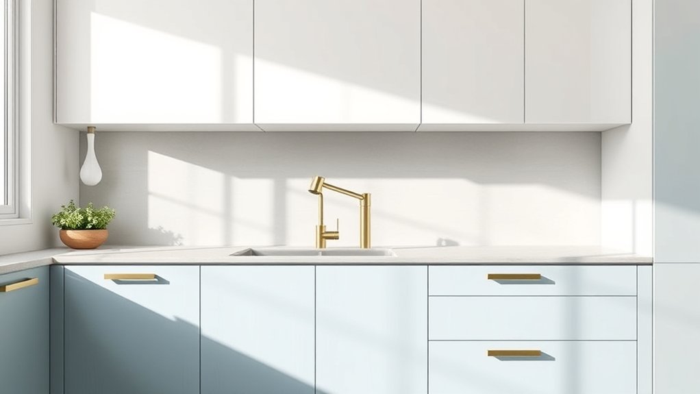
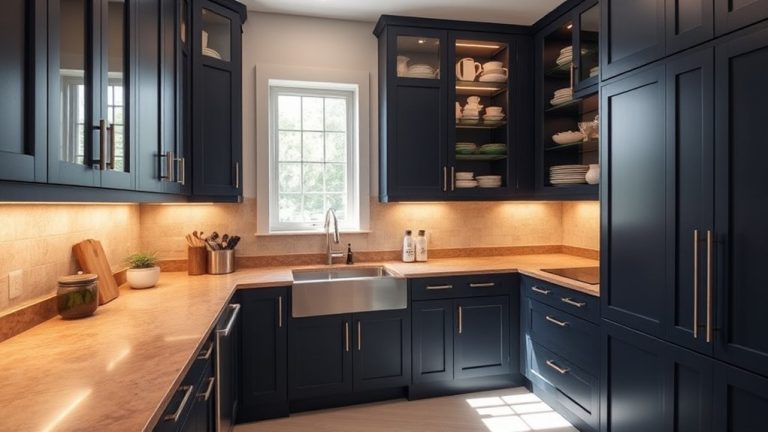
As homeowners look for fresh, modern styles, the top kitchen cabinet colors for 2026 blend timeless elegance with trendy accents. Bold blues and deep greens are trending, offering a striking yet versatile vibe.
Soft earthy tones like warm taupe and muted olive continue to be popular, providing a calming backdrop. When choosing cabinet colors, think about how your hardware complements your selection.
Soft earthy tones like warm taupe and muted olive create calming, versatile kitchen backdrops.
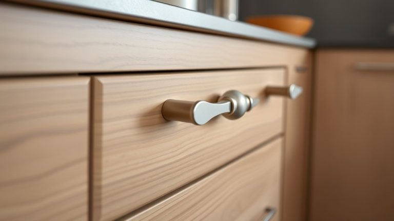
Brushed golds and matte blacks add a touch of sophistication, while brass accents bring warmth. Coordination with your countertops is essential; light-colored quartz or marble surfaces pair beautifully with darker cabinets for a balanced look.
On the other hand, matching darker hues with sleek dark countertops can create a modern, seamless aesthetic. Picking colors that work well with your hardware and countertops will help you craft a cohesive and timeless kitchen style.
These trending shades will brighten your space and make your kitchen both stylish and inviting in 2026.
Neutral Colors That Calm and Add Elegance
Neutral colors continue to be a popular choice for creating a calming and sophisticated kitchen environment. Their subtle tones promote a sense of tranquility, rooted in color psychology, helping you feel more relaxed while cooking or gathering.
These shades, like soft grays, warm beiges, and creamy whites, boost the overall aesthetic without overwhelming the space. They also improve kitchen ergonomics by providing a versatile backdrop that highlights your appliances, artwork, or accessories.
Choosing neutral hues makes it easier to update your decor over time, ensuring your kitchen remains stylish and timeless. These colors reflect light well, making your space feel brighter and more open.
Plus, their understated elegance complements various design styles, from modern to rustic. By opting for neutral tones, you create a balanced, inviting atmosphere where functionality and aesthetic harmony work together seamlessly.
Vibrant Shades That Make a Bold Statement
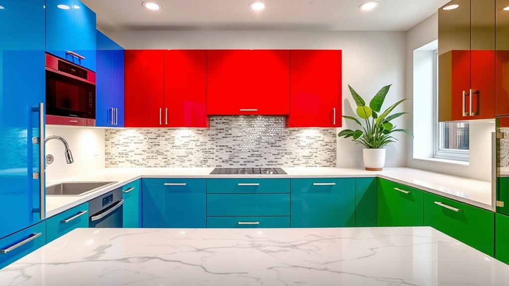
Bright colors can really grab your attention and turn your kitchen into a lively, eye-catching space. Don’t hold back—go for bold shades that show off your personality and make a statement.
And the best part? You can mix and match these vibrant hues with complementary colors to keep everything balanced and visually appealing. So, have fun with it and let your kitchen reflect your unique style!
Bright Hues for Impact
Bright hues are making a striking comeback in kitchen cabinet design, instantly grabbing attention and setting a lively tone.
Vibrant shades like fiery reds, energetic yellows, and bold teals inject personality into your space, creating a dynamic atmosphere.
These colors aren’t just eye-catching; they’re rooted in color psychology, inspiring feelings of warmth, happiness, and enthusiasm.
As kitchen paint trends evolve, homeowners are increasingly choosing bold shades to make a statement.
When you opt for bright hues, you’re not only updating your cabinets but also transforming your entire kitchen into a vibrant hub.
Keep in mind that these colors work best when balanced with neutral countertops and subtle accents, ensuring your bold choice remains the star without overwhelming the space.
Dare to Be Different
If you want your kitchen to stand out, don’t shy away from daring, bold shades that make a statement. Vibrant colors like fiery red, electric blue, emerald green, and sunny yellow can totally transform your space. These shades tap into color psychology, boosting energy and creativity in your kitchen.
When choosing bold hues, consider material durability. Go for finishes that resist chipping and fading to keep your kitchen looking fresh over time. Here are four reasons to dare with vibrant shades:
- They create a striking focal point.
- They reflect your personality and style.
- They inspire confidence and mood-boosting energy.
- They can be paired with neutral accents for balance.
Bold colors demand attention and can redefine your kitchen’s atmosphere with the right choice.
Complementary Color Pairings
To make bold shades really pop in your kitchen, pairing them with complementary colors is key. Using color psychology, vibrant shades like emerald green or royal blue become striking when balanced with warm reds or oranges. Proper paint application techniques, like precise brushwork or roller coverage, enhance these pairings’ impact.
Consider this table for inspiration:
| Bold Color | Complementary Shade |
|---|---|
| Emerald Green | Warm Red |
| Royal Blue | Bright Orange |
| Fuchsia | Lime Green |
| Turquoise | Coral |
These combinations create a dynamic visual effect, making your kitchen stand out. When choosing colors, focus on contrast and cohesion to evoke energy without overwhelming the space.
How to Pick the Right Cabinet Colors for Your Style and Space
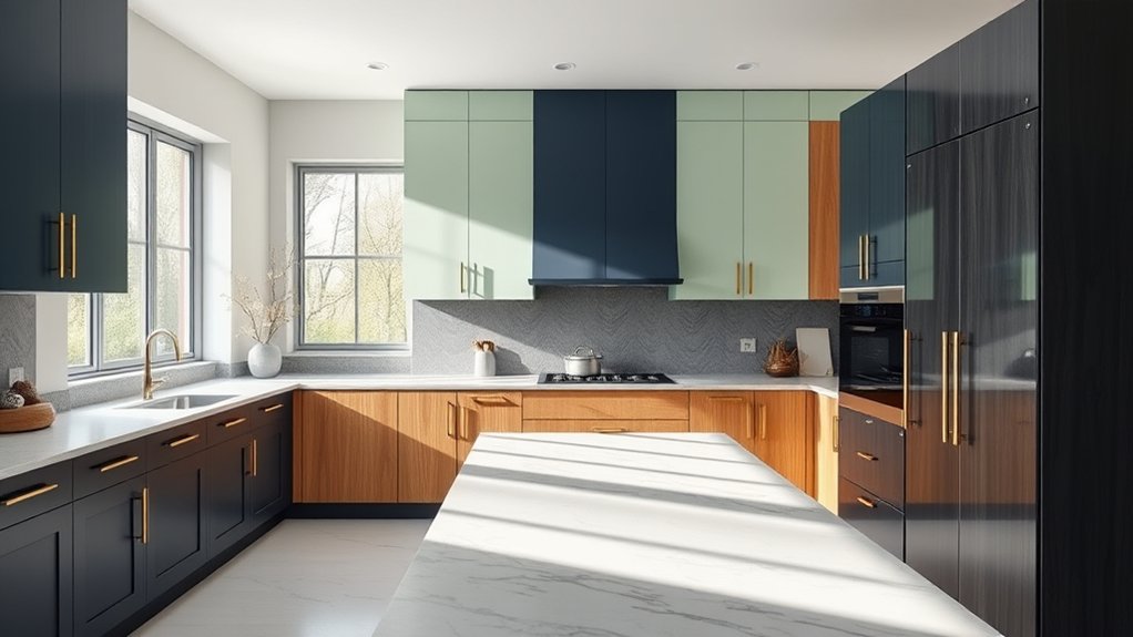
Looking to pick the perfect cabinet colors? A good place to start is by matching them with your existing home decor. This helps create a cohesive, put-together look that feels just right.
Don’t forget to consider your room’s size and the amount of natural light it gets. Lighter shades can make a space feel bigger and brighter, while darker colors add depth and warmth.
And most importantly, choose colors that truly reflect your personal style. After all, your kitchen should feel like you — a space that’s both beautiful and uniquely yours.
Match Your Home Decor
Choosing the right cabinet colors means thinking about how they’ll match your current home decor. To keep everything looking cohesive, consider your existing style and color palette.
Here are some tips to help you pick the perfect cabinet colors:
- Use custom color matching to create a seamless look that ties your cabinets to other elements in your space.
- Go for eco-friendly finishes to add sustainability without sacrificing style.
- Coordinate your cabinet colors with your wall paint or backsplash for a unified appearance.
- Think about accent colors that highlight your decor, like decorative accessories or furniture.
Consider Room Size and Light
The size of your room and the natural light it gets can really change how cabinet colors look and feel. Lighter shades can make small kitchens seem more spacious, while darker tones add depth in larger rooms.
Think about the lighting: bright spaces work well with bold colors, while softer hues suit dimmer areas. To keep your paint looking great, pick finishes that handle moisture and everyday use well.
Here’s a quick guide:
| Room Size | Ideal Colors |
|---|---|
| Small | Light, reflective shades |
| Large | Deep, rich tones |
| Dimly lit | Bright, warm hues |
Matching your cabinet colors to your room size and lighting helps create a balanced, inviting space. It also showcases your style and stands up over time.
Reflect Personal Style
Your personal style plays an essential role in choosing cabinet colors that truly reflect who you are and suit your space. To do this well, think about how your tastes influence your choices.
Pick colors that match your overall look—whether it’s modern, rustic, or traditional. Consider your storage needs too—lighter shades can make small kitchens feel bigger, while darker hues add warmth.
Match your cabinet hardware with your style—sleek metals for a contemporary vibe or vintage finishes for a classic touch. Show off your personality with bold or muted tones, making sure the color fits your lifestyle.
Best Light-Reflecting Colors for Small Kitchens
When aiming to make a small kitchen feel brighter and more spacious, choosing light-reflecting colors for your cabinets is key. Light shades like whites, soft neutrals, and pastels bounce more light around, giving the room an airy vibe.
These colors also boost your kitchen’s natural light, making it seem larger. Going for glossy or semi-gloss finishes enhances reflectivity and makes a big difference.
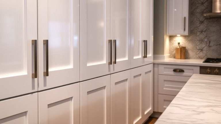
Light-reflecting colors and glossy finishes instantly brighten and expand your small kitchen space.
When picking colors, think about how they match your storage solutions and hardware. Sleek, modern hardware looks great with crisp whites, while warm neutrals pair nicely with brass or matte black accents.
Light-reflecting colors also help hide minor imperfections on your cabinets, keeping everything looking fresh. A coordinated color palette and well-chosen hardware amplify the feeling of openness.
Ultimately, these colors set a bright, welcoming tone that makes your small kitchen feel more inviting and functional.
Warm Tones vs. Cool Tones: Which Palette Suits You?
Thinking about warm tones versus cool tones? Well, your choice really shapes the overall vibe of your kitchen. Warm colors tend to make the space feel cozy and inviting, while cool tones can give it a fresh, calming feel. It’s all about the mood you want to set!
Also, don’t forget to think about how these colors will work with your existing decor. You want everything to come together seamlessly, creating a look that feels balanced and stylish. When you pick a palette that matches your personal style, selecting the perfect cabinets becomes a lot easier.
Atmosphere and Mood
Have you ever wondered how the color palette of your kitchen cabinets can influence the overall atmosphere? Your choice affects mood improvement through color psychology. Warm tones like reds, oranges, and yellays create a cozy, inviting space, boosting energy and comfort.
Cool tones such as blues, greens, and grays promote calmness and focus. They make your kitchen feel tranquil and spacious. Consider these factors:
- Warm tones evoke friendliness and warmth.
- Cool tones inspire relaxation and clarity.
- Bright hues energize the room.
- Muted shades foster serenity and simplicity.
Your selection ultimately shapes the ambiance, influencing how you feel while cooking or socializing. By understanding mood effects, you can choose a palette that matches your desired atmosphere and elevates your daily experience.
Complementary Decor Choices
Choosing the right decor to complement your kitchen cabinets depends on whether you want to emphasize warmth or coolness in the space. Kitchen color psychology plays a crucial role here. Warm tones like reds, oranges, and earthy browns create inviting, energetic atmospheres. Cool tones like blues, greens, and grays evoke calmness and serenity.
Your cabinet hardware styles also influence the overall vibe. Sleek, modern handles suit cool color palettes, while vintage or rustic hardware complements warm tones. Consider how accessories, backsplash choices, and even curtain fabrics can reinforce your preferred palette.
Popular Two-Tone Cabinet Color Combinations in 2026
In 2026, two-tone cabinet color combinations are still a popular trend, adding contrast and depth to your kitchen in a stylish way. Using contrasting finishes creates visual interest and highlights different areas.
Two-tone cabinets add stylish contrast and depth, creating visual interest and highlighting different kitchen areas.
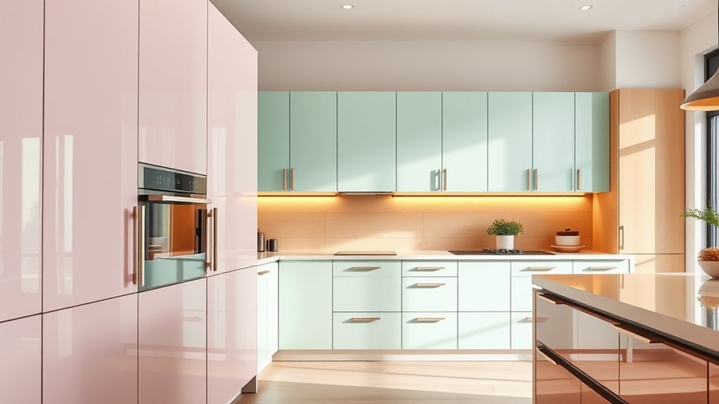
Popular combos include white upper cabinets with dark navy or charcoal lower cabinets for a clean, modern look. Soft pastels like mint or blush paired with sleek gray or black create a subtle yet striking effect.
Warm wood tones contrasted with cool-toned paint colors bring warmth and sophistication. Bold hues like emerald green or deep burgundy combined with neutral finishes make a dramatic statement.
These contrasting finishes let you customize your space, balancing light and dark elements to boost the overall look. Two-tone cabinets are versatile and timeless, making your kitchen both stylish and functional.
How to Incorporate Trending Colors Without a Full Remodel
Updating your kitchen with trending colors doesn’t require a full remodel; simple changes can make a big difference. Start by swapping out cabinet hardware to instantly refresh the space. Brass or matte black finishes look great with popular colors like navy or sage green.
Think about painting just the upper or lower cabinets to introduce a new hue without doing a complete overhaul. Understanding color psychology can help you pick shades that boost your mood, like calming blues or energizing yellows.
If you’re hesitant to commit to a full paint job, try adding accessories like open shelves, colorful dishware, or decorative accents. These small updates boost your kitchen’s look and let you experiment with color trends without long-term commitment.
Tips for Maintaining and Caring for Colored Cabinets
To keep your colored cabinets looking their best, regular cleaning is key, but make sure to use the right products so you don’t damage the finish. Proper maintenance helps keep the colors vibrant and protects your investment. Here are four tips to help:
- Use a gentle, non-abrasive cleaner and soft cloths to avoid scratches.
- Clean cabinet hardware regularly to prevent buildup that can tarnish or corrode.
- Organize your kitchen to minimize clutter around cabinets, which reduces the chance of accidental damage.
- Apply a protective polish or sealant every now and then to maintain color and finish.
Keeping your kitchen tidy and well-organized makes cleaning easier and helps your cabinets last longer. Focus on gentle cleaning and pay close attention to hardware, since it’s usually the first thing to show wear. With regular care, your colored cabinets will stay vibrant and beautiful for many years.
Timeless Colors That Will Outlast 2026 Trends
Maintaining the beauty of your kitchen cabinets over time means choosing colors that stand the test of trends. Timeless hues like classic whites, soft grays, and warm beiges remain versatile and elegant. These shades pair well with eco-friendly materials, giving your kitchen a sustainable, stylish look. Vintage-inspired palettes, such as muted teals or dusty rose, add charm without overpowering your space. These colors are less affected by changing trends and can easily adapt to new decor styles.
| Classic Whites | Soft Grays |
|---|---|
| Warm Beiges | Vintage-Inspired Teal |
| Dusty Rose | Eco-Friendly Materials |
Opting for these enduring colors guarantees your kitchen stays fresh and stylish for years, regardless of trends. They effortlessly complement eco-conscious choices and vintage accents, creating a timeless, inviting space.
Frequently Asked Questions
Are There Any Eco-Friendly or Sustainable Cabinet Color Options Trending in 2026?
Yes, in 2026, eco-friendly finishes and sustainable color palettes are trending for kitchen cabinets. You can choose finishes made from low-VOC or natural materials that reduce environmental impact.
Opt for earthy tones like muted greens, warm beiges, and soft browns, which reflect sustainable color palettes. These options not only look stylish but also support eco-conscious living.
They help you create a beautiful, environmentally friendly kitchen space that’s both functional and stylish.
How Do Cabinet Colors Influence Overall Kitchen Lighting and Ambiance?
You might not realize it, but cabinet colors dramatically shape your kitchen’s lighting effects and ambient atmosphere.
Light colors reflect more, making your space feel brighter and more open. Darker shades create cozy, intimate vibes.
Choosing the right hue can transform how natural and artificial light interact, setting the mood you desire.
What Are the Best Color Choices for Aging-In-Place or Accessible Kitchens?
For aging-in-place or accessible kitchens, choose cabinet colors that are calming and easy to maintain, like soft neutrals or muted blues. These shades create a soothing atmosphere and help reduce visual clutter.
Pick durable finishes that can handle daily wear and tear, so your cabinets stay beautiful over time. It’s a simple way to keep your kitchen looking fresh and inviting.
To maintain your cabinets’ color and finish, clean them gently and avoid harsh chemicals. Regular upkeep keeps them looking their best and extends their lifespan.
These color choices promote safety, making it easier to see and navigate your kitchen. They also create a warm, welcoming space that’s both functional and inviting.
Can Custom Cabinet Colors Be Personalized to Match Existing Home Decor?
Yes, you can definitely personalize custom cabinet colors to match your existing home decor. With custom color matching, you can choose paint options that fit perfectly with your style.
This helps create a seamless look throughout your space. Work with your cabinet maker or painter to pick the exact shades you want.
Whether it’s a specific hue or a unique finish, customizing ensures your kitchen looks one-of-a-kind.
How Do Color Trends Vary Across Different Regional or Cultural Kitchen Styles?
Ever wondered how regional color influences and cultural aesthetic preferences shape kitchen styles? You’ll find that warm, earthy tones tend to dominate in rustic or Mediterranean-inspired kitchens.
Sleek, monochromatic palettes, on the other hand, often suit modern or minimalist spaces. Different regions prioritize colors that reflect their cultural roots, making each kitchen uniquely vibrant.
Conclusion
As you explore the most popular kitchen cabinet colors of 2026, remember that trends come and go. Your personal style should always take center stage.
Don’t hesitate to mix and match or pick timeless hues that never go out of fashion. Choosing colors that reflect your space and personality will make your kitchen both stylish and functional.
In the end, the best kitchen cabinet colors of 2026 are the ones that make you feel at home. After all, beauty really is in the eye of the beholder.